
.webp)


This article breaks down how to structure your app's page hierarchy, widget by widget, using research from Baymard Institute, Nielsen Norman Group, Google's Material Design, and mobile ergonomics studies. The goal is simple: help users find what they want in the fewest taps possible.



%20(1).png)
If your app feels cluttered or hard to use, the problem is rarely the design. It is the hierarchy. Every screen is made up of widgets (header, navigation, product grid, cart, search) and if these are not stacked in the right order, users get lost before they buy anything.
A phone screen gives you a fraction of the space a desktop browser has. That forces hard choices about what goes where.
Research from the Information Architecture Authority recommends keeping primary task flows to a maximum of three levels of hierarchy. Go deeper than that, and users have to hold too much context in their heads while jumping between screens, which increases errors on small devices.
Nielsen Norman Group's mobile research backs this up: users complete tasks in short bursts, often under two minutes per session. Your hierarchy needs to get them from open to action fast, not walk them through your full catalog.
The numbers on what happens when hierarchy fails are stark. Baymard Institute's 2026 mobile app benchmark found that 71% of leading ecommerce apps rate "mediocre" or worse on UX, with none reaching "good" or "perfect." Separately, Baymard's navigation research shows that stores with well-optimized navigation tend to see conversion lifts in the 30 to 60% range, and that roughly 7 in 10 shoppers rely on navigation or search as their main way of finding products. Hierarchy is not a design preference. It is a revenue lever.
Think of your app as a stack of layers, from the widgets a user sees the second they open the app, down to the widgets they only reach after several taps.
The header sits above everything else and does two jobs: branding and light-touch navigation. Keep it in two parts.
Do not overload this layer. It is a signpost, not a destination. Its only job is to tell users where they are and give them one-tap access to menu and cart.
This is the widget users interact with most, so it deserves the most research-backed thinking.
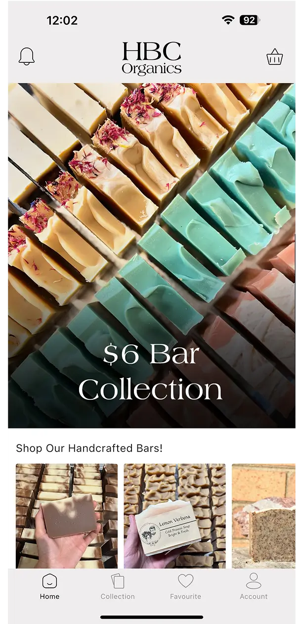
Google's Material Design guidelines lay out the logic clearly: your primary navigation should surface every top-level destination in the hierarchy. Apps with several top-level sections can use a navigation drawer, a bottom bar, or tabs, but drawers make more sense once you pass five destinations, while a bottom bar is built for three to five.
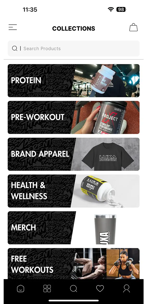
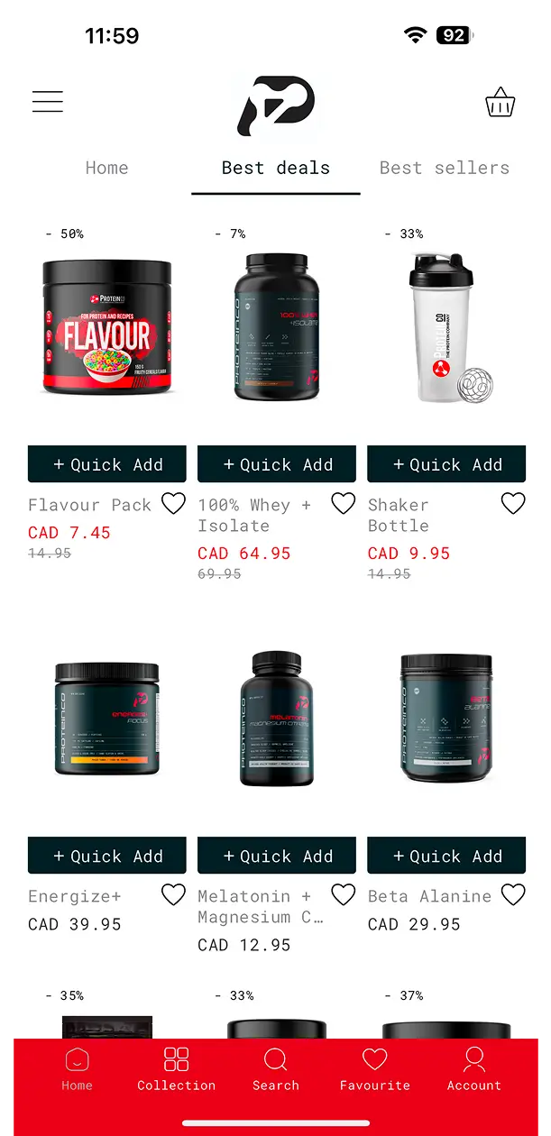
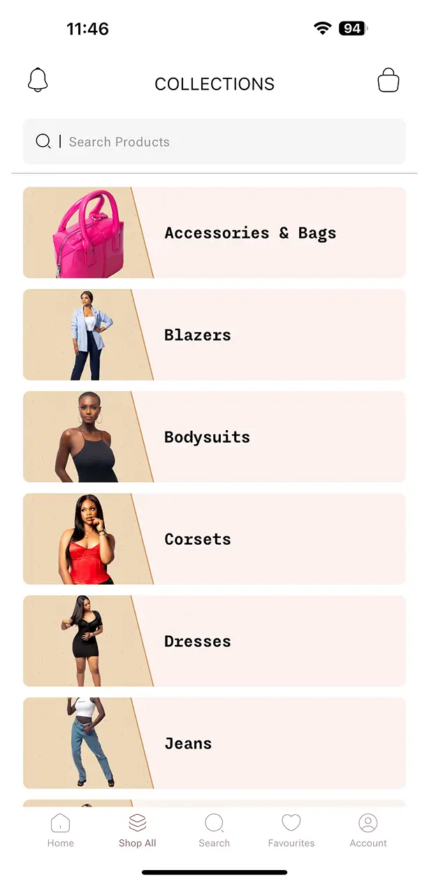
In practice, most successful shopping apps land on four or five bottom tabs: Home, Collections, Search, Favorites, and Account. This matches what UX researchers consistently recommend for bottom tab bar design: stick to three to five main options.
Anything beyond those top five destinations belongs in a side drawer, not the bottom bar. That is where nested menu items, deeper collections, and less-frequent actions (settings, help, logout) should live.
Why the bottom bar wins over hamburger menus for primary actions
This is where mobile ergonomics research becomes directly useful. Steven Hoober's landmark 2013 field study observed over 1,300 smartphone users in the wild and found that roughly half operate their phone with a single thumb, another third cradle the phone in one hand while that thumb does the work, and the rest use two thumbs. In other words, the overwhelming majority of interactions are thumb-driven, and the thumb has a limited natural range.
That range breaks into three zones, as this breakdown of thumb-zone design explains: an easy zone across the bottom third of the screen where the thumb rests naturally, a stretch zone in the middle third that needs a bit of extension, and a hard zone at the top that forces users to shift their grip entirely.
A hamburger menu tucked in the top corner sits squarely in that hard zone, and it hides your navigation behind an extra tap. A bottom tab bar sits exactly where the thumb already lives. This is why bottom navigation consistently outperforms hidden menus for the actions users take most often.
Below the header and navigation sits the homepage itself, built from blocks: banners, featured collections, and product highlights.
This is where you set first impressions. Baymard's homepage research found that most leading sites deliver only a "mediocre" to "poor" homepage and category navigation experience, and that two-thirds of mobile sites fall into that range. Most brands waste this layer on decoration instead of using it to route users toward their highest-intent next step: a collection, a sale, or a specific product.
Keep the homepage widget stack shallow. Two or three blocks that answer "what's new" and "what's popular" beat a long scroll of unrelated banners.
Once a user picks a direction, they land in a collection grid or search results. This layer is where most of the actual browsing time happens, and it is unforgiving of clutter.
The core widgets here are the grid layout, product cards, and filter or sort controls. Good practice, according to this ecommerce navigation breakdown, means a search bar placed prominently at the top of every screen, with predictive suggestions and filters for price, size, and color. Get this wrong and users bounce before they ever reach a product page.
Nested filtering and sorting should stay visible but collapsed by default. A user should never scroll more than a screen or two before seeing a clear way to narrow results.
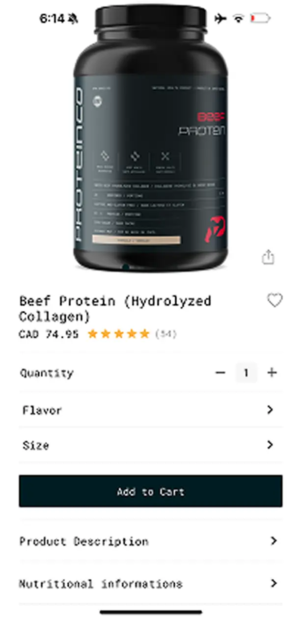
The product page is where browsing turns into a decision. This widget stack typically includes an image gallery, pricing, variant selectors, reviews, and related products.
The order matters. Put pricing and the primary "add to cart" action within the thumb's easy reach, not buried below a long description. Reviews and related products can sit lower on the page since users scroll for those deliberately.
This is the final and most sensitive layer of the hierarchy. Every widget here (quantity selectors, discount code field, checkout button) should reduce friction, not add it.
Placing the checkout button in the thumb's easy zone matters more here than anywhere else in the app. Research on conversion-focused mobile design has found that just a few extra seconds of friction can push mobile bounce rates up by as much as 20%, while placing key actions where the thumb already rests removes the mental effort that drives completions.
Read Also: 5 best Shopify mobile app builders in 2026
Account details, order history, and language or currency settings sit at the bottom of the hierarchy because users visit them rarely and with a very specific goal in mind. Keep this layer simple and predictable. It is not a place for merchandising or upsells.
Every widget you add should answer one question: does this help the user move down the stack faster? If a widget only adds visual noise without shortening the path to checkout, it does not belong in the hierarchy, no matter how good it looks in a mockup.
Baymard's research is a useful gut check here: navigation and findability remain the single biggest UX factor in whether an ecommerce app converts. Build your hierarchy around that, and the rest of your design decisions become much easier to make.
Content strategist and technical storyteller specializing in the SaaS and e-commerce space. I’m passionate about translating complex technical concepts into clear, actionable guides and helping brands build high-impact digital marketing engines.
Create a feature-rich mobile experience, harness AI-powered marketing tools, and send unlimited push notifications without paying commissions.
Try Tapday for free



Create a feature-rich mobile experience, harness AI-powered marketing tools, and send unlimited push notifications without paying commissions.
Try Tpaday for free.svg)
© 2025 Tapday, Technologies, Inc. All rights reserved.
.png)



%20(1).webp)
%20(1).webp)
%20(1).webp)
.webp)
